Q.1 In what forms does your media products use, develop, or challenge forms and conventions of real media products?
Before creating my media products I researched into existing horror products to find out the common codes and conventions used. This would help my final products appear as professional as possible by adhering to the main conventions, whilst allowing me to challenge and develop certain aspects to make my products stronger and have greater appeal to the target audience.
I researched extensively into the well-known horror posters, trailers and websites to analyse the main codes and conventions. I chose a high key image for my poster and website as I wanted it to stand out from the usual dark black and red theme. This was inspired by researching ‘The Last Exorcism’ poster, which also used a high key image with a white and red colour scheme. To keep it conventional I used a typical font and layout of both my website and poster. My trailer also followed the main conventions by being within the common time frame as to get the audience exited in the film but not to give too much of the plot away.
The poster I created used and challenged many conventions of typical horror posters. The main posters I analysed whilst creating my product was ‘The Last Exorcism’ and ‘The Human Centipede’. I chose these two in particular as I thought the typical dark atmosphere with the red and black colour scheme had been overdone, and these two poster examples had both approached the horror theme in a different way (as seen in video 1).
I decided to use high key lighting to make my poster stand out from the norm, and also challenged the usual villain stereotype by using a young girl as the villain for my poster. This combined with the clinical bright lighting created a high impact image where everything was exposed to the audience. The name of the film is the second most prominent feature on the poster, which entices the viewer to go see the film as the name ’Anonymous’ creates a sense of mystery and makes the viewer want to find out more. Another feature that uses this is the image of the girl with her face covered by her hair hiding her identity therefore creating fear on the unknown in the viewer. The girl is standing directly in the middle of the frame, with a direct mode of address suggesting power and dominance, and almost intimidating the viewer. The image is anchored by the tagline of ‘nameless, faceless’ again a very open ended title as to not give to much information away. I decided to use these features so the narrative was not instantly given away, provoking the viewer to think about the film. The colours green white and black were used, which were very unconventional however I thought more appropriate to the sub genre of the film as it was more of a psychological horror than gore, therefore the connotation of red wouldn’t have been necessary.
I stuck to a conventional font type and layout as the rest of my poster was quite unconventional, so the audience would instantly know that it was a horror film.
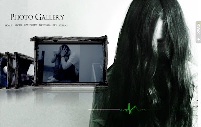
To keep a similar house theme throughout my products I used the same colour scheme, fonts and images in my website as my poster. This also helps make the website more user friendly and easier to navigated around, along with the navigation bar being in the same place on every page which is a common theme of many professional websites. I used screen shots from the trailer and took extra photographs for the background of my website to add extra visual impact to the pages, also to relate it to the trailer. I wanted each page to have its own look, however still realte to the rest therefore chose separate images. Most of the images were subtle suggestions of what was going to happen in the plot, without giving too much away and creating suspense in the viewer. For example on my 'About' page, the image is of the victim reading a computer screen alone, surrounded in shadow. This also links to the actual page, as it seems as though he himself is reading the plot. This helps to create a slicker website as the audience would understand it quicker.
 |
| Anonymous 'About' page |
 |
| 'Anonymous' Website |
 |
| 'The Last Exorcism' Website |
I used viral marketing techniques by adding links to social media sites such as Facebook and Twitter to allow the audience to access further information about the film, also to widen exposure of Anonymous. Because of the close link between social media sites and the horror website it adds an element of ‘realness’ to the viewer creating greater fear.I challenged usual horror website conventions of horror websites by not using red in the colour scheme. I chose this to make my website stand out from the rest, also as the plot of the film is focused on more on the paranormal than gore I thought is was more appropriate.
Prior to creating the film trailer I analysed ‘The Last Exorcism’ and ‘The Ring’. Common features in both these trailers were dark mise en scene; main protagonist, antagonist and also a main victim and duration.
I challenged and developed many aspects in my trailer. First of all the villain was a young girl, instead of the usual middle-aged man. This was chosen as to create a sense of shock, as usually children are seen as being innocent. We chose to film most of the trailer inside a suburban house, as to create a false sense of security. The bedroom is usually a place of safety, whereas in our trailer it’s where the attack happens.Similar to the poster and website, the colours and lighting used was quite different from the norm. Throughout the trailer no blood or scenes of violence/murder are shown, as we thought that this would create suspense in the viewer, as they would not know what is going to happen. We went for the psychological approach, of using mind tricks and disturbing the victim without actually showing any brutal murder scenes as we thought this woud be more effective, and a successful develeopment form the common gore scenes of many horror trailers. The use of sharp fast cuts and cutaways was key to making this technique effective.
 |
| Screen capture from trailer |
We stuck to some conventions of horror trailers such as the timing, as we felt that 1-2 minutes was enough time to convey the plot and make the viewer want to see the film, however not too long for it to become boring. We chose a common editing style and pace used in most trailers, where the beginning starts with slower cuts and shots, such as camera pans, to set the location of the trailer and introduce the characters. The slower cuts also build tension, as later on in the trailer faster straight and jump cuts are used as he villain is introduced and the action starts to happen, so the editing matches the pace of the events. The quicker cuts allow for the villains identity to not be exposed, as we only show flashes of her, for example right at the end of the trailer.
Instead of conveying the plot by having a linear set of events, we mixed them up to change between before and after the villain appears, as to keep the audience on their feet as there not award of whats going to happen next. As with many horror trailers such as the last exorcism, we showed the institutional information at the beginning of the trailer, and the title of the film a the end as it would be the last thing the viewer see's, therefore more likely to remember it.
Q.2 How effective is the combination of your main product and ancillary texts?
The combination of my 3 products, a website, poster and trailer were successful as they had a consistent theme throughout. This helped the audience to recognise all the products are linked together, also for marketing purposes helps to promote the film. I placed the image of the villain on all products to keep a consistent theme; I also did this with the name of the film. As our plot contained an element of technology I used static, common horror iconography in each of my products but in different ways. For my trailer and website I used the static as a transition, however with the poster I simply overlaid it onto the image.


I kept the colour scheme and fonts the same throughout as it is a typical font seen on many horror themed products, therefore the viewer would instantly recognize the genre, and I also made each product relatable to the plot of the film by including images of the villain. The institutional information also appears on all products for marketing purposes and also acts as a seal of approval, so the viewer knows all 3 products are linked together, however in the trailer we developed the 'NU Globe' logo by animating it with lighting effects to make it stand out more, also we thought this would make it flow better with the trailer instead of having a static image.
As the purpose of the ancillary tasks was to promote and inform the audience about the film, I made sure each product was equally attention grabbing and had high impact through the use of lighting and colour, whilst also keeping the products similar to each other. To do this I kept the theme of the static running throughout all my products, which is also seen as modern horror iconography, to relate with the digital aspects in the plot and also distort the images behind it so the villains identity is never fully given away. This also made it easier to link a moving image product with a text based one. To further combine my products successfully i incorporated them into each other, for example having the trailer automatically play on my website, as a way of further informing the viewer about the film and tying the two different platforms together. I took advantage of using 3 different medias to advertise the film succesfully, for example using sound effects in the trailer and website to emphasise the action happening and set the mood through atmospheric music, something that i wasn't able to do with the poster.
I wanted to keep all of my products minimalistic as to create a bigger impact to the viewer. This combined with the over exposed high key theme across all 3 products was an effective way of tying them together, as they all are strong enough on their own yet work together as well. This factor i think was one of the main succeses of my products as it has challenged usual horror conventions of dark backgrounds and images, and it has successfully worked in a poster trailer and website.
Qu.3 What have you learned from your target audience feedback?
From our target audience feedback we learnt that our trailer didn't convey the narrative enough and certain shots went on for too long. As we wanted to keep the trailer fast paced to keep the audience excited the narrative got lost as the straight cuts were too short to show any story, also that the villains motives weren't explained enough or the relationship between the villain and the victim was unclear. To solve this we re-filmed several shots to help convey the genre, by making the establishing shots and the shots introducing the characters longer so the audience has a longer time to understand whats happening, and then the action shots faster as its more obvious as to whats happening. As with the shots we had that were unnecessary long, we simply cut them down in Sony Vegas to make the trailer flow better. One thing that was often said about our trailer was how effective the different use of shots were, as in our trailer we made use of a wide variety such as CU shots, MS and LS.
 |
| LS |
 |
| MS |
 |
| CU |
One of the ways in which i gathered information from the audience to recieve feedback was a questionnaire.
This was to gather information about the audiences favourite horror sub genre, what type of horror films appealed to them and what they woud like to see and not to see in a horror film. The majority said that they preferred psychological horror to gore, therefore we chose this to base our plot around. We found out that many people prefer to be mentally challenged whilst watching a horror film, and have to think about the storyline rather than it being too obvious. They also said that they prefer fast action, and for the story not to be dragged out too long, therefore we use fast jump cuts and straight cuts to speed up the action. From the feedback we also decided to use a blue hue colour correction in our trailer to give it a colder atmosphere, as most of our trailer was filmed inside therefore too yellowy. Another way in which we gathered audience feedback was through social media sites such as Facebook and youtube. This allowed us to get a vast amount of feedback from a wide variety of people. Our feedback from Youtube was positive, and many people commented about the professionalism and effectiveness of the trailer. For my poster i created 3 different mock ups to see which ones the target audience preferred. After choosing one i then further developed it to conform to the main features of horror posters. After this i then sought out feedback, which was generally positive apart from a few minor changes such as the positioning of the title and sizing of the institutional logos, which after correcting helped my poster to look as professional as possible.


Qu4. How did you use media technologies in the construction and research, planning and evaluating stages?
During these stages of developing my final products, i used a wide range of media technologies.
Firstly when carrying out the research into exiting products the internet was the most useful to source the needed images and information. Through sites like Youtube i was able to research both old and new horror trailers, which was useful as i could see the development in themes and technology and analyse the key conventions.
When planning the trailer i sketched out a storyboard for each key frame, scanned them into the computer and added text on top in photoshop. I then imported this into iMovie to create an animatic with the storyboard to show the different sound effects and transitions that would be used in the final trailer. When filming the trailer we used a nikon d300i as well as a canon 5d to achieve a high definition picture. With certain shots we used the 5d where we wanted there to be more detail, for example the close up of the victims eye. However we did encounter some problems when editing with Sony Vegas as several shots had been over processed due to over rendering - therefore wasn't as higher definition as it should be. We soon fixed this by going back to the original files and only colour correcting it once.
When filming the shots we also used a tripod to achieve a steady shot. This was especially effective when filming the panning shots as it allowed us to rotate the camera whilst fixed to a steady base. We edited the filmed shots in Sony Vegas, as this was used by many professional fim makers and allowed us to do more things with the trailer. We added the sound and cuts into the trailer using sony vegas as well. When the final trailer was finished it was uploaded onto Youtube so it could be embedded into the website.
When creating my poster i also used many different media technologies. First of all i shot the image for the poster in a studio to create the desired lighting effect. One soft box was used on the top left to cast shadows from the figure, also to create a paranormal effect i purposely overexposed the top left of the image. This was shot using a canon 40D. I then started to edit the image and add text onto it in Adobe Photoshop Cs5. I started off by burning and doding the figure to bring out the highlights and shadows, also to darken the hair. As the hair wasn't as long as i had wanted i extended it using the clone stamp tool. A few subtle changes were also made such as adding extra blood onto the figures gown to create more of an impact. I adjusted the colour balance to give the eerie green hue to the image - as i was going for a paranormal effect, combined with overlaying a static texture onto the image. I kept the text minimal as to not overcomplicate the image and simply added a couple of blood drops on the title of the film to link it to he horror genre. With the image for the poster i wanted to keep it quite minimal as i thought the figure was powerful enough to create an impact on its own. When creating my website i used the online website publication programme www.wix.com, however i would have preferred to use Dreamweaver as this would have allowed me to alter the design exactly how i wanted it, but i was directed to use wix instead. With this i was able to add animations and flash images to my website to make it more interactive.
In my evaluation i have used several different technologies to evaluate my work. For example in question one i have created short presentations using imovie to demonstrate my written points. I used imovie as it was quick and simple to use for what i wanted it for, even though its not the best of video editing software. I have also added several images and screen shots of my poster website and trailer to further emphasise the points written in my evaluation.
During these stages of developing my final products, i used a wide range of media technologies.
Firstly when carrying out the research into exiting products the internet was the most useful to source the needed images and information. Through sites like Youtube i was able to research both old and new horror trailers, which was useful as i could see the development in themes and technology and analyse the key conventions.
When planning the trailer i sketched out a storyboard for each key frame, scanned them into the computer and added text on top in photoshop. I then imported this into iMovie to create an animatic with the storyboard to show the different sound effects and transitions that would be used in the final trailer. When filming the trailer we used a nikon d300i as well as a canon 5d to achieve a high definition picture. With certain shots we used the 5d where we wanted there to be more detail, for example the close up of the victims eye. However we did encounter some problems when editing with Sony Vegas as several shots had been over processed due to over rendering - therefore wasn't as higher definition as it should be. We soon fixed this by going back to the original files and only colour correcting it once.
 |
| Original shot |
 |
| Over processed shot |
When filming the shots we also used a tripod to achieve a steady shot. This was especially effective when filming the panning shots as it allowed us to rotate the camera whilst fixed to a steady base. We edited the filmed shots in Sony Vegas, as this was used by many professional fim makers and allowed us to do more things with the trailer. We added the sound and cuts into the trailer using sony vegas as well. When the final trailer was finished it was uploaded onto Youtube so it could be embedded into the website.
When creating my poster i also used many different media technologies. First of all i shot the image for the poster in a studio to create the desired lighting effect. One soft box was used on the top left to cast shadows from the figure, also to create a paranormal effect i purposely overexposed the top left of the image. This was shot using a canon 40D. I then started to edit the image and add text onto it in Adobe Photoshop Cs5. I started off by burning and doding the figure to bring out the highlights and shadows, also to darken the hair. As the hair wasn't as long as i had wanted i extended it using the clone stamp tool. A few subtle changes were also made such as adding extra blood onto the figures gown to create more of an impact. I adjusted the colour balance to give the eerie green hue to the image - as i was going for a paranormal effect, combined with overlaying a static texture onto the image. I kept the text minimal as to not overcomplicate the image and simply added a couple of blood drops on the title of the film to link it to he horror genre. With the image for the poster i wanted to keep it quite minimal as i thought the figure was powerful enough to create an impact on its own. When creating my website i used the online website publication programme www.wix.com, however i would have preferred to use Dreamweaver as this would have allowed me to alter the design exactly how i wanted it, but i was directed to use wix instead. With this i was able to add animations and flash images to my website to make it more interactive.
In my evaluation i have used several different technologies to evaluate my work. For example in question one i have created short presentations using imovie to demonstrate my written points. I used imovie as it was quick and simple to use for what i wanted it for, even though its not the best of video editing software. I have also added several images and screen shots of my poster website and trailer to further emphasise the points written in my evaluation.